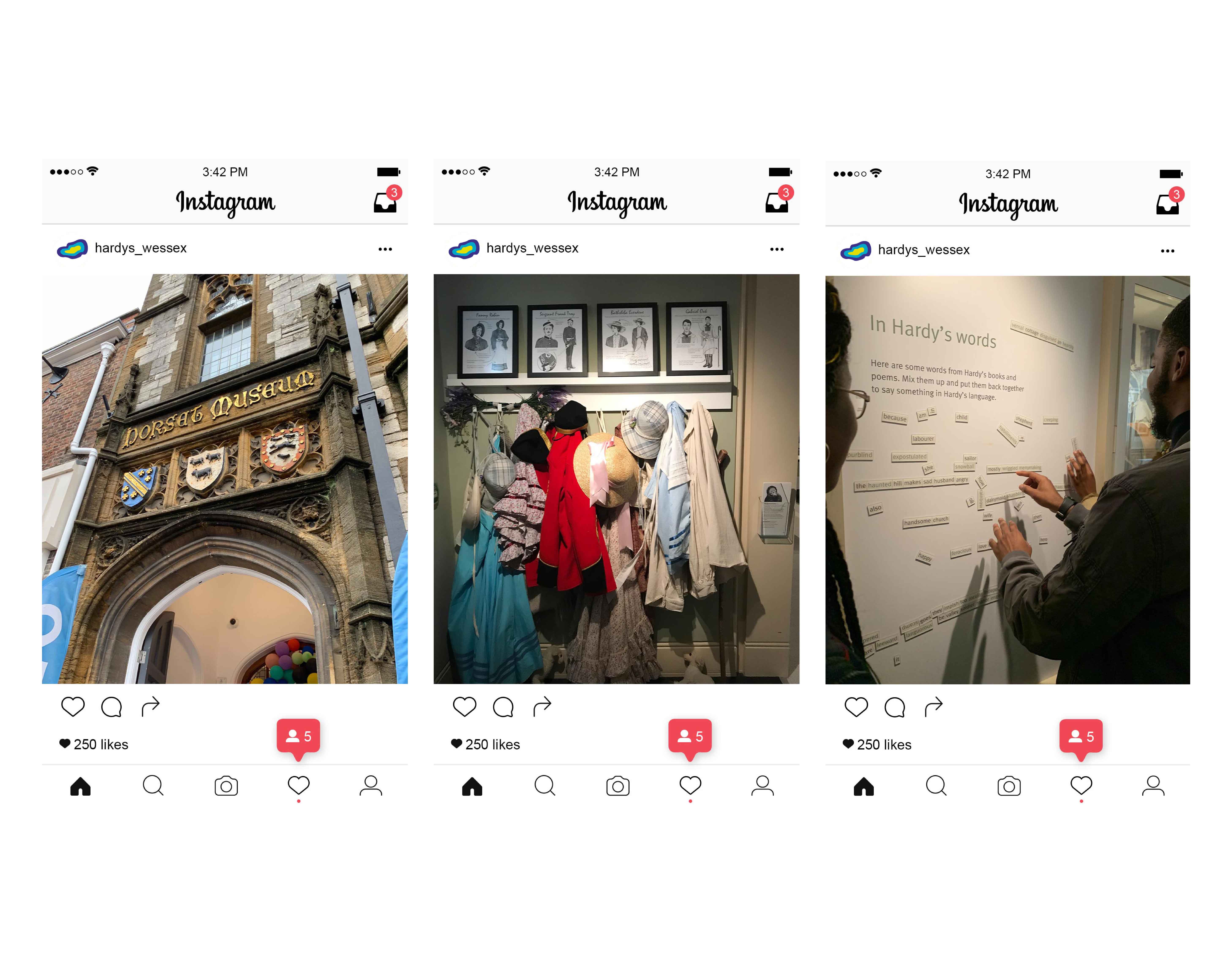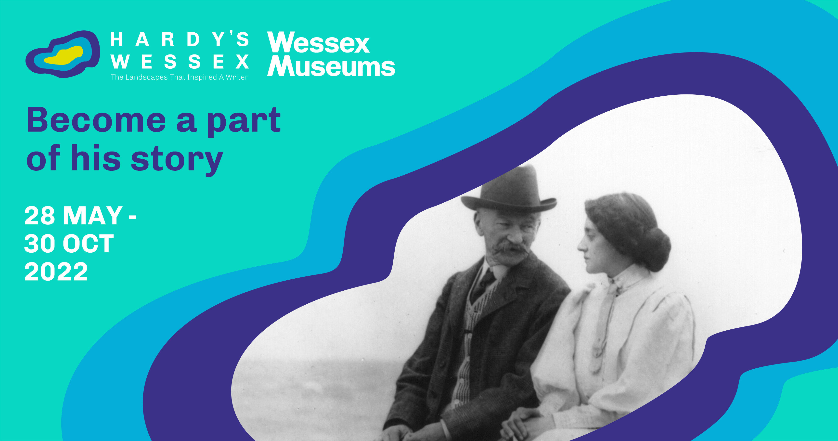
Hardy's Wessex Branding
Role: scamping, logo design, mockups
Team: Savoy O'Connor, Ness Gagnon, Fortune Aduroja
Programs: Photoshop, InDesign, Illustrator
Brief & Challenge
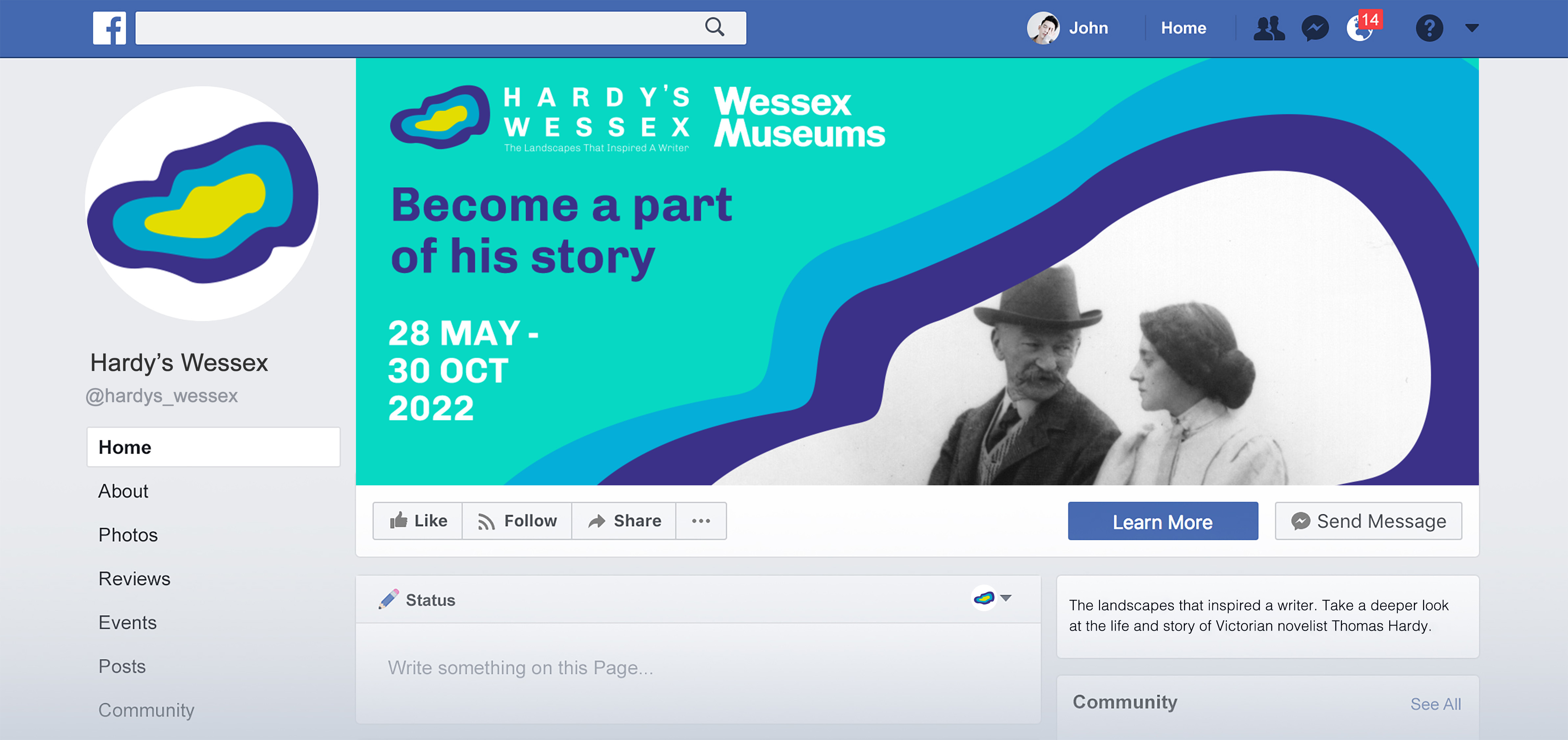
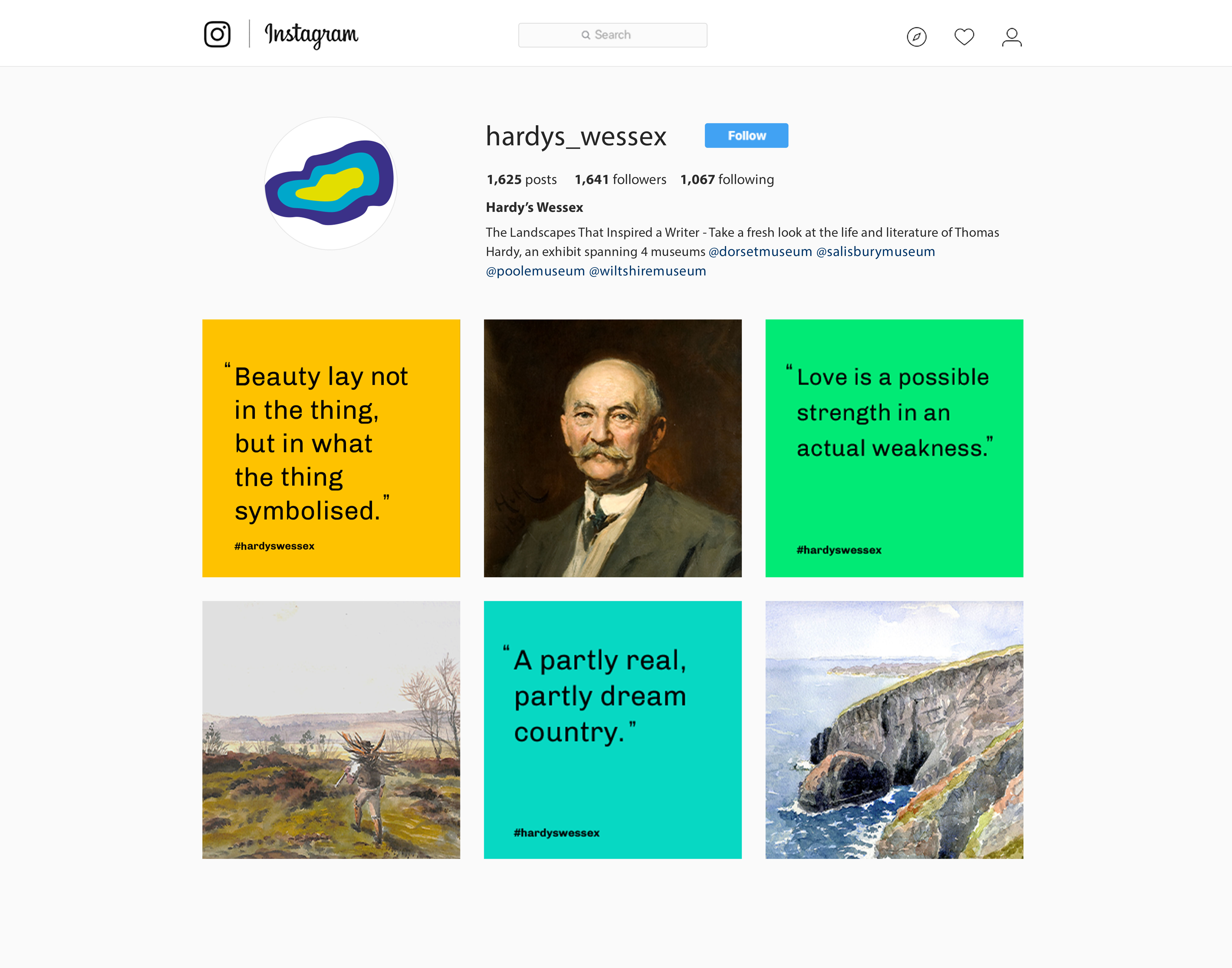
A brand identity to promote the life and works of Thomas Hardy, for the exhibit Hardy’s Wessex: The landscapes that inspired a writer.
To design an identity that appealed to younger people whilst not alienating long-time fans of his work. How do you bridge the gap between two vastly different demographics?
Research
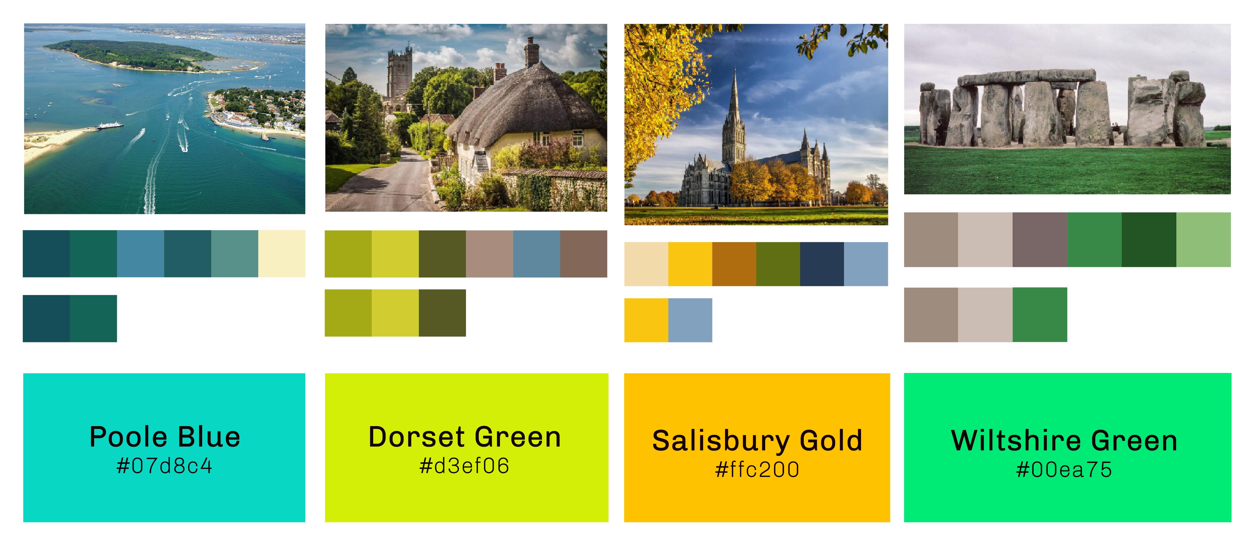
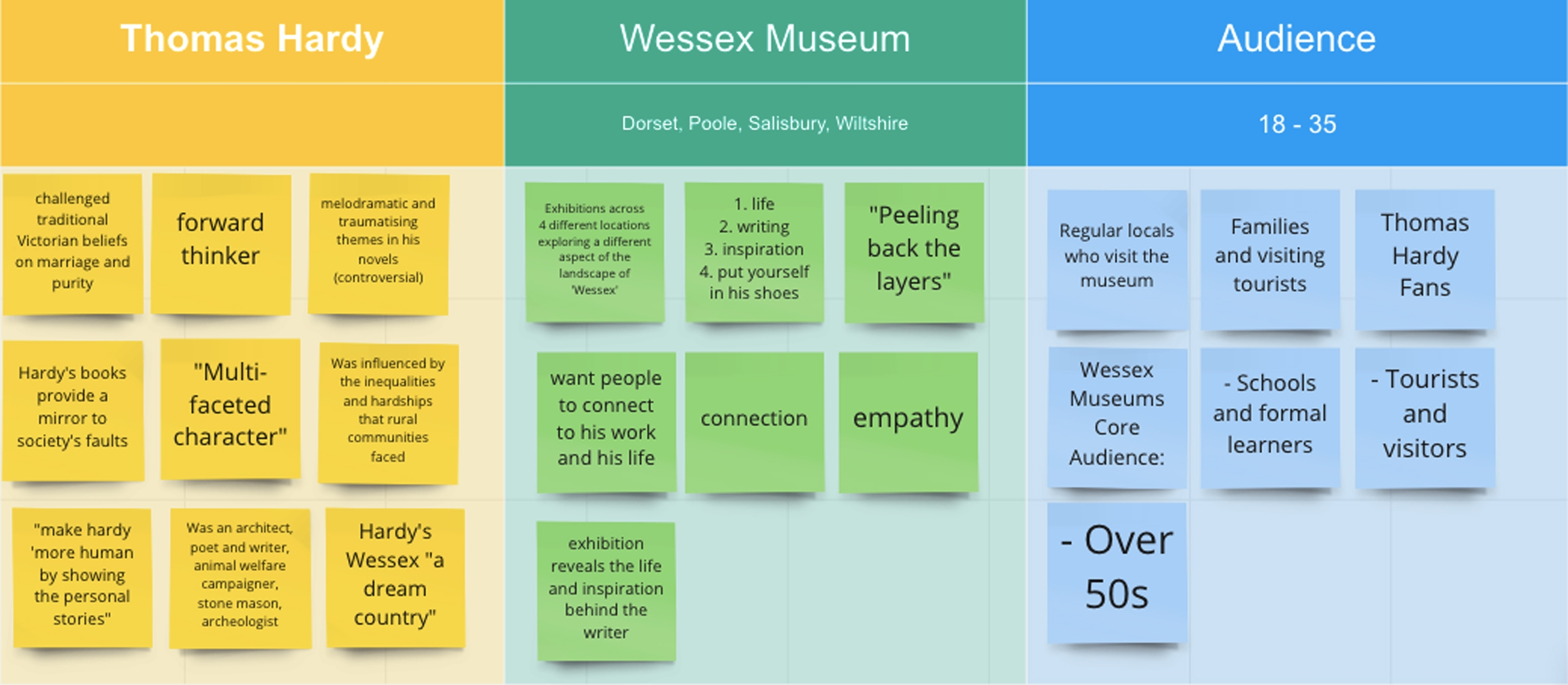
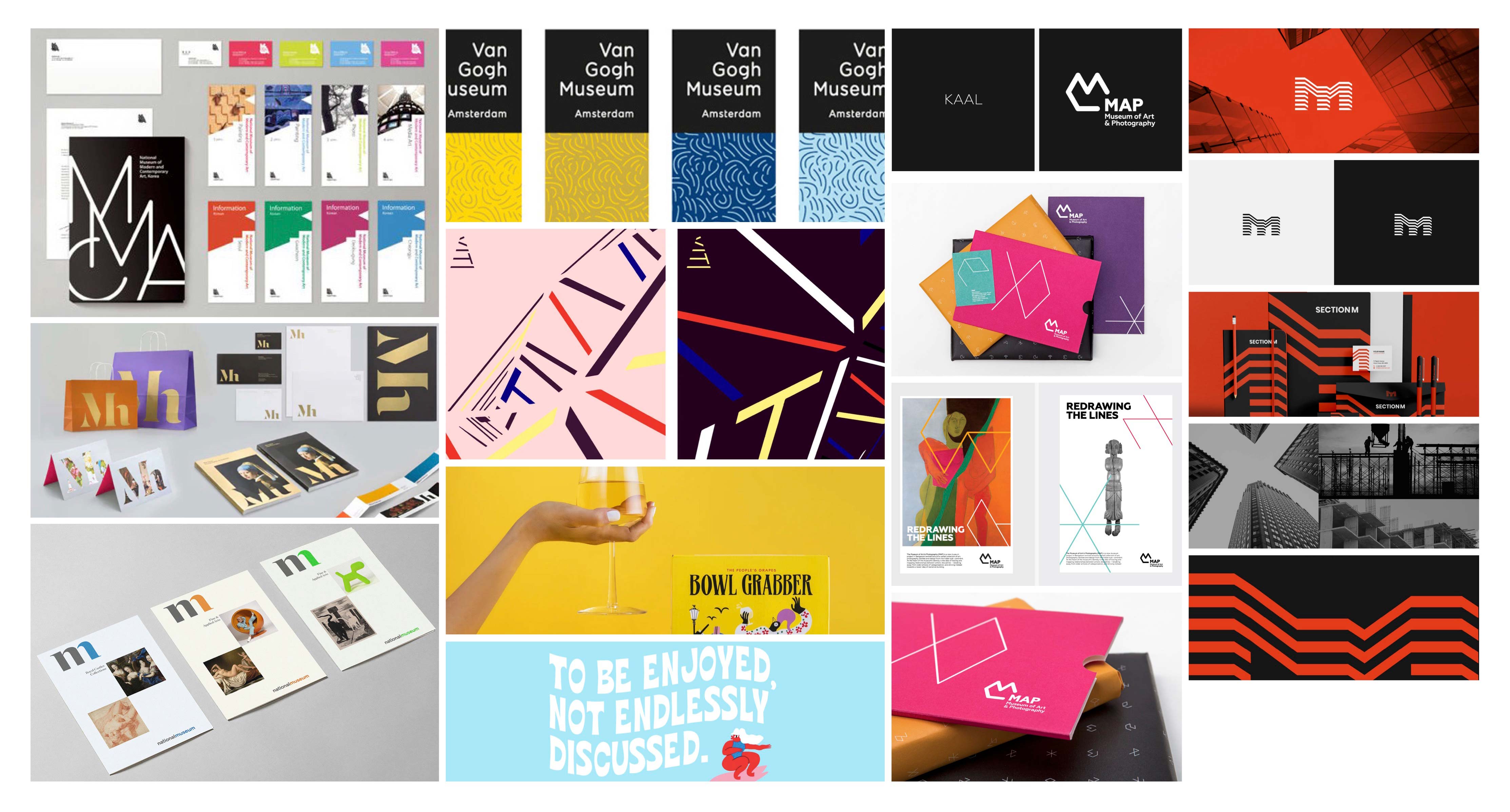
We started off by collecting our research together into different museums branding and how they communicate to their audience. We looked into the colour schemes, font choices and brand touchpoints they used, to see how it all aided their brand purpose. I looked into the Van Gogh Museum and general companies to get a wide variety of research.
Brand Purpose
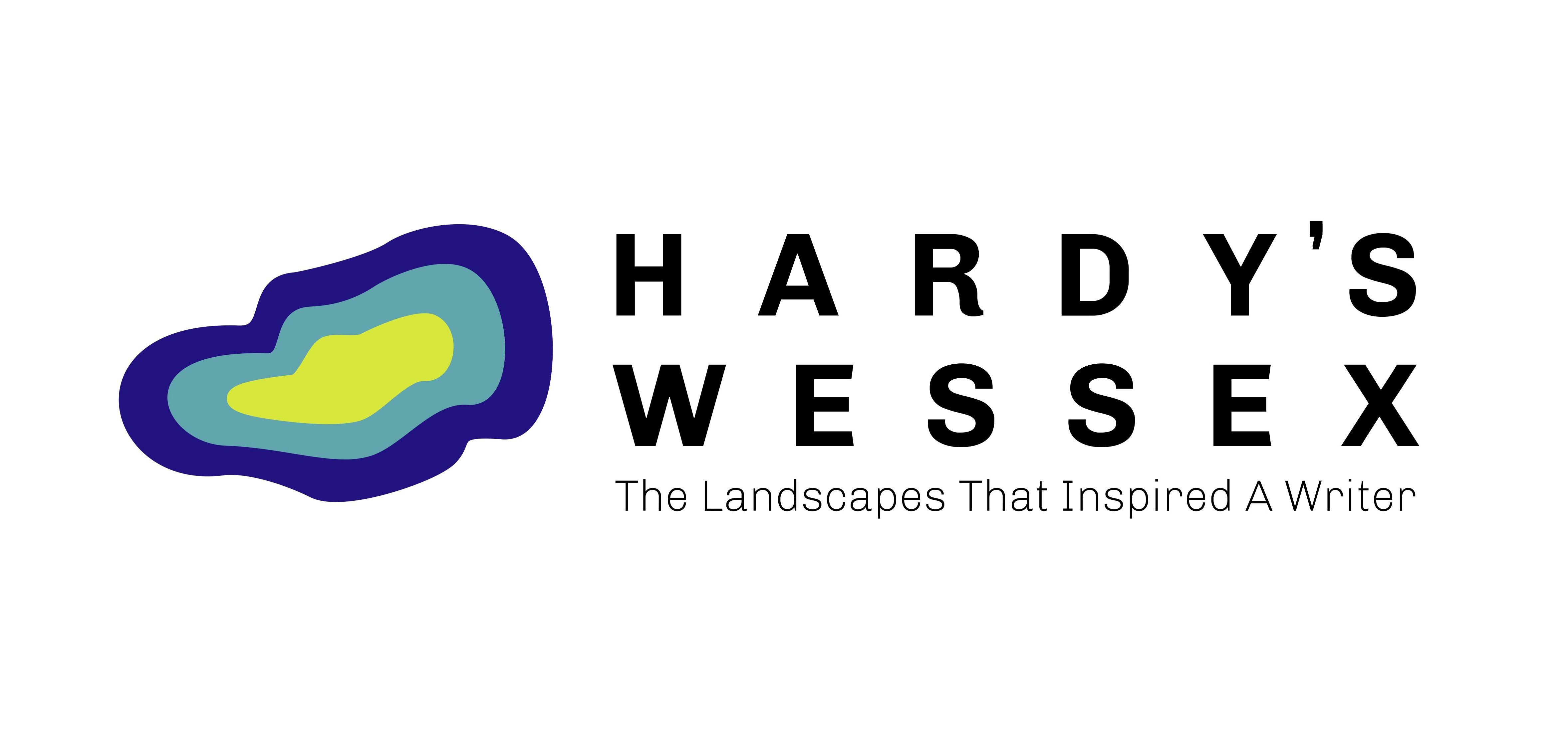
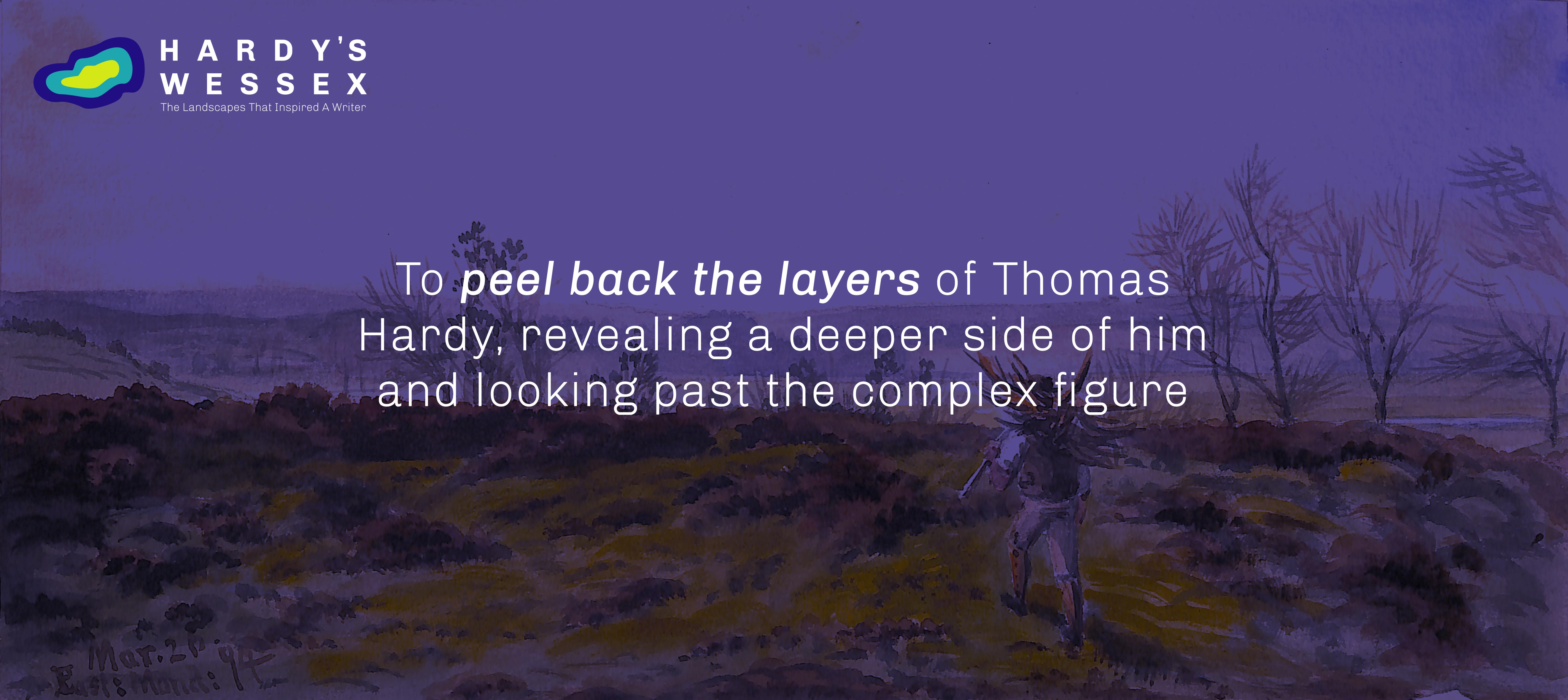
As Hardy was greatly influenced by the Dorset landscapes around him, we went with a geological approach to our brand. As Hardy was a controversial figure at the time, we felt visualising the exhibit “digging” into him as a person was a unique approach, to carry throughout our identity.
