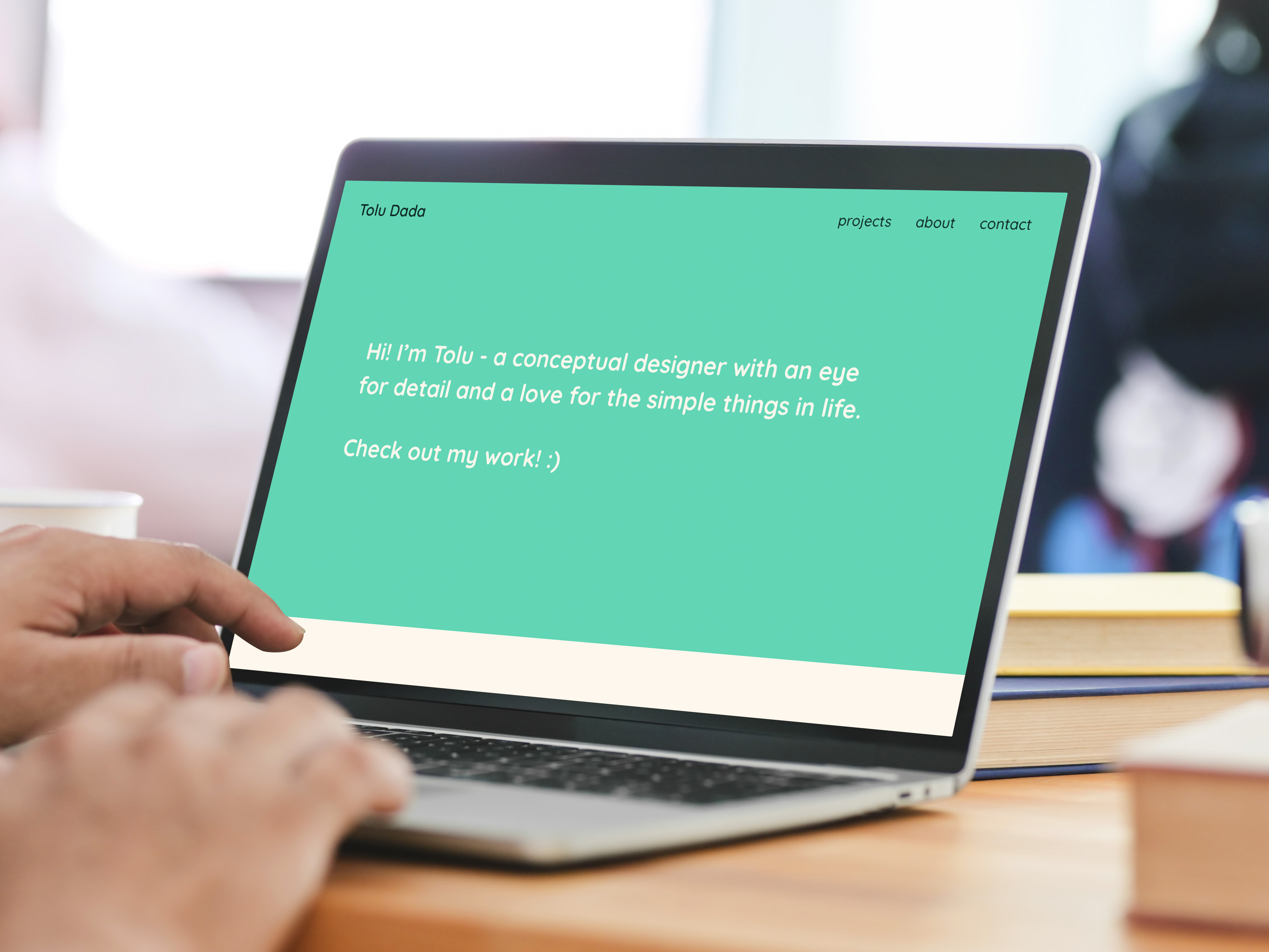
Website Portfolio
Programs: BBEdit, Adobe XD, Illustrator
Brief & Challenge
A website that encapsulates myself as a designer and defines my position somewhere in the industry.
The biggest challenge was defining myself as a designer, choosing colours, fonts & styles that best represent me as a whole.
Visual Research
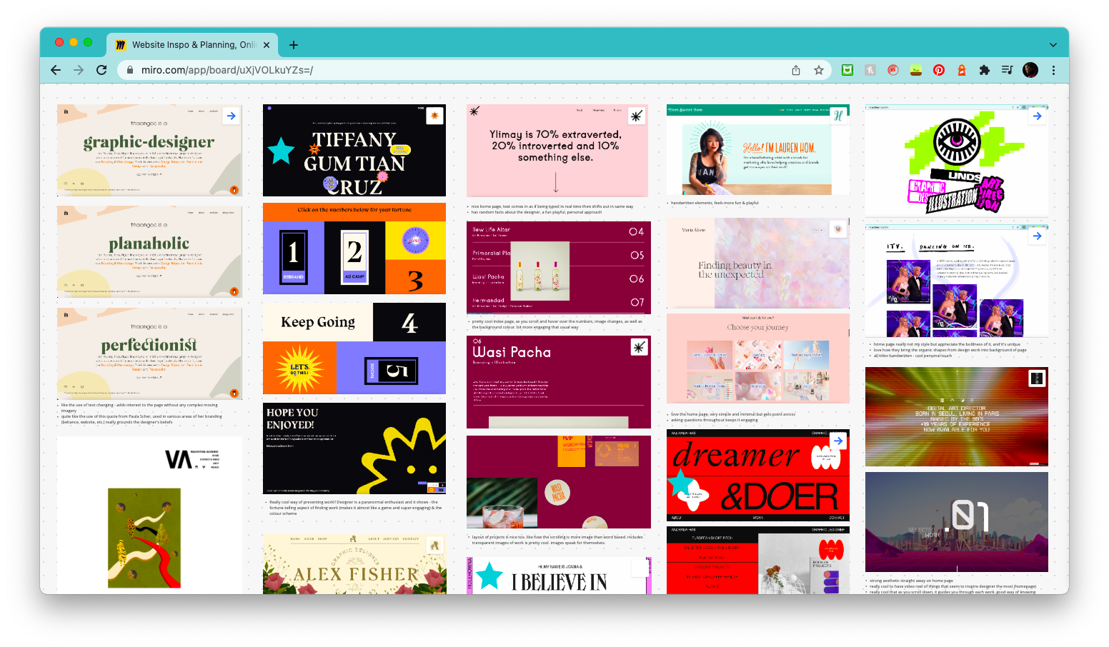
Early on, I looked into a variety of website portfolios, to gain inspiration for my own. I analysed their UI, the ways they laid out their projects and parts I liked about them. A lot of them started off with their values on the homepage, whereas others leaned purely into personal interests. I found that a lot of them used 3 columns to display their work on the homepage, however, felt that 2 columns would be best for this project, to present the 4 briefs.
Learning coding
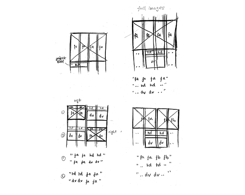
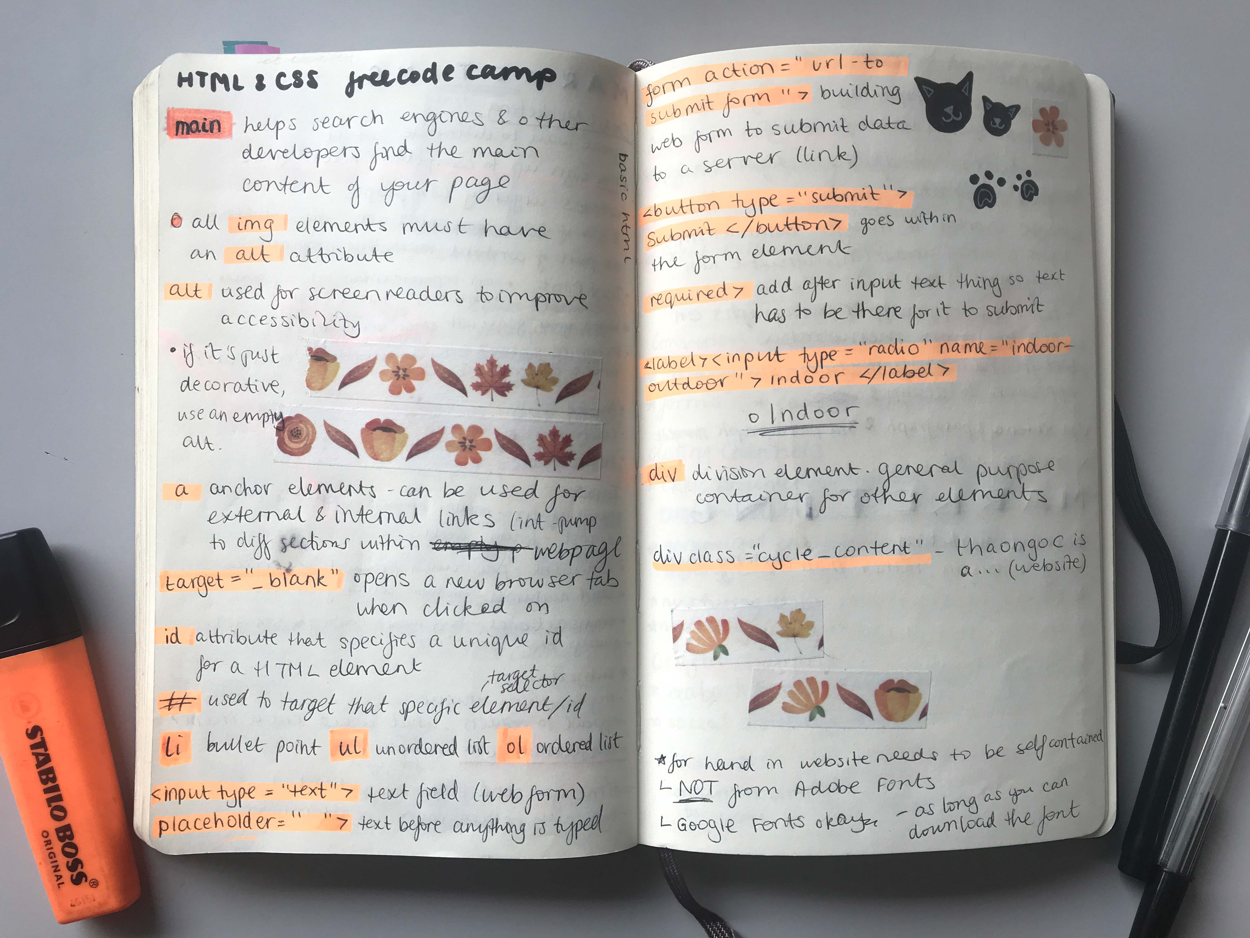
Attending the workshops and going through the lessons on freeCodeCamp helped me learn the fundamentals of HTML and CSS. In particular, learning how to create and assign classes was useful, to organise my coding better. Also, learning how to use BBEdit was important, as were the tips and shortcuts to make my coding process more efficient.
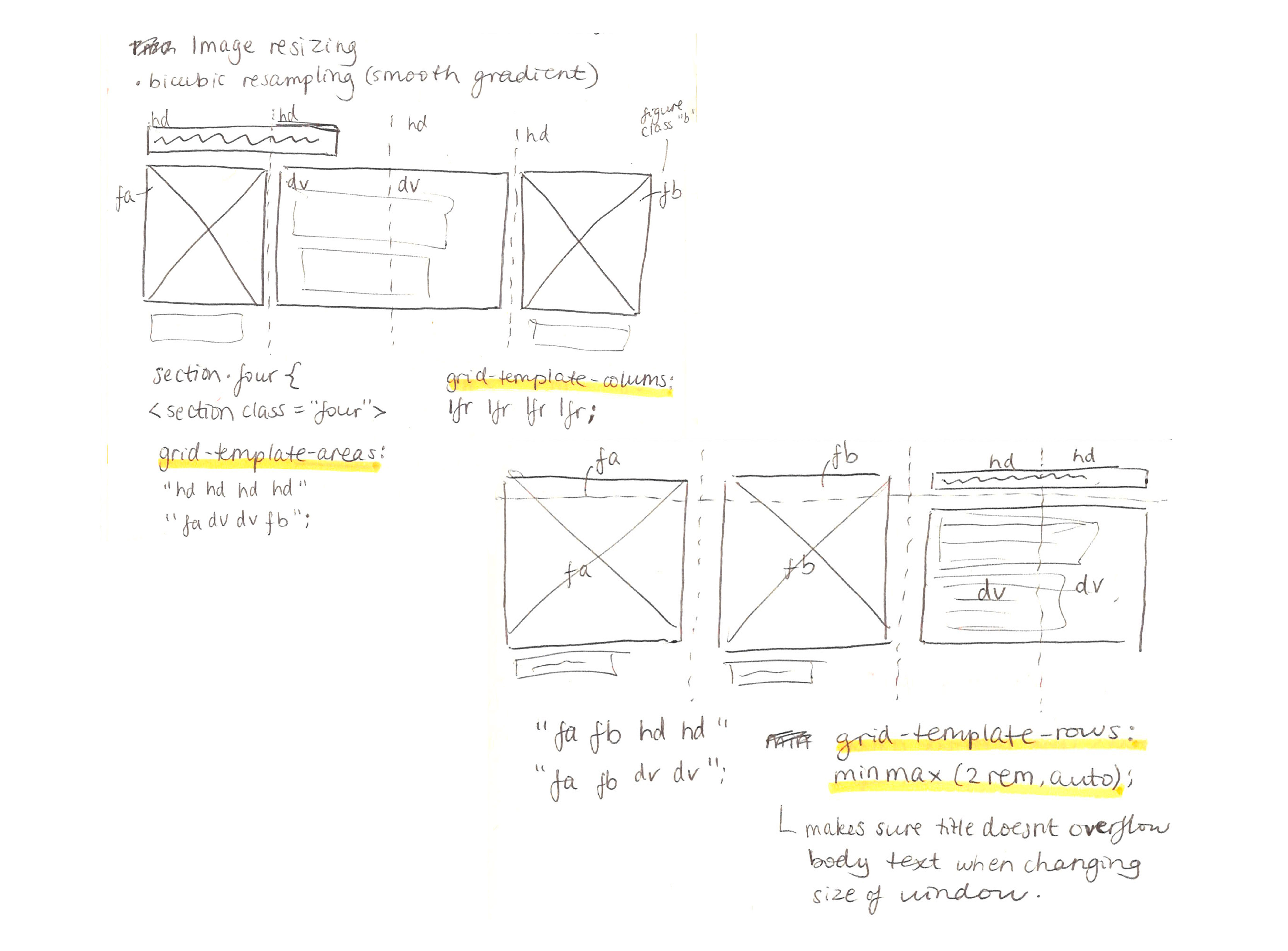
Another really useful tip I learnt from the workshops was drawing out my grid before putting it in the CSS. As a visual learner, it made it much easier to understand the styling.
Personal Branding
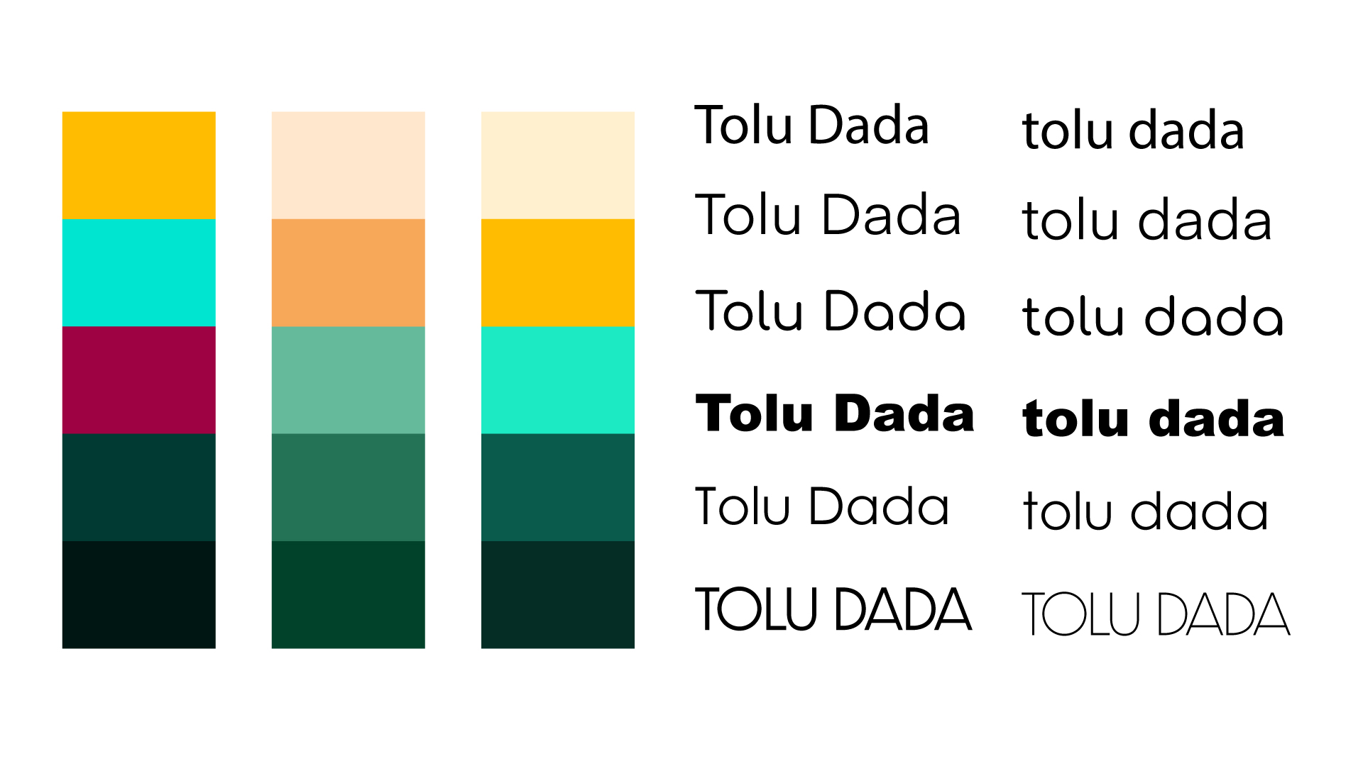
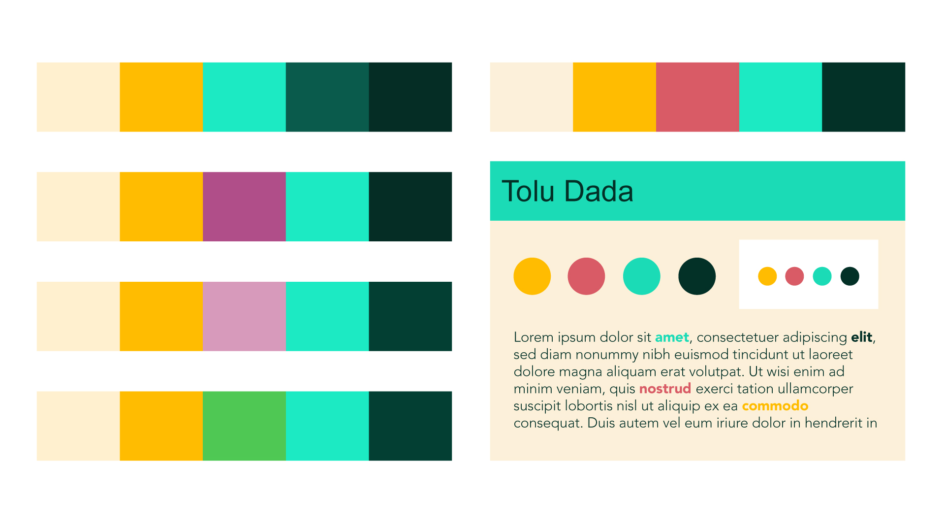
This was a very tricky aspect of the project for me. I looked into a variety of examples online, of personal branding, and struggled with deciding on a final one for myself, being more of a multidisciplinary designer.
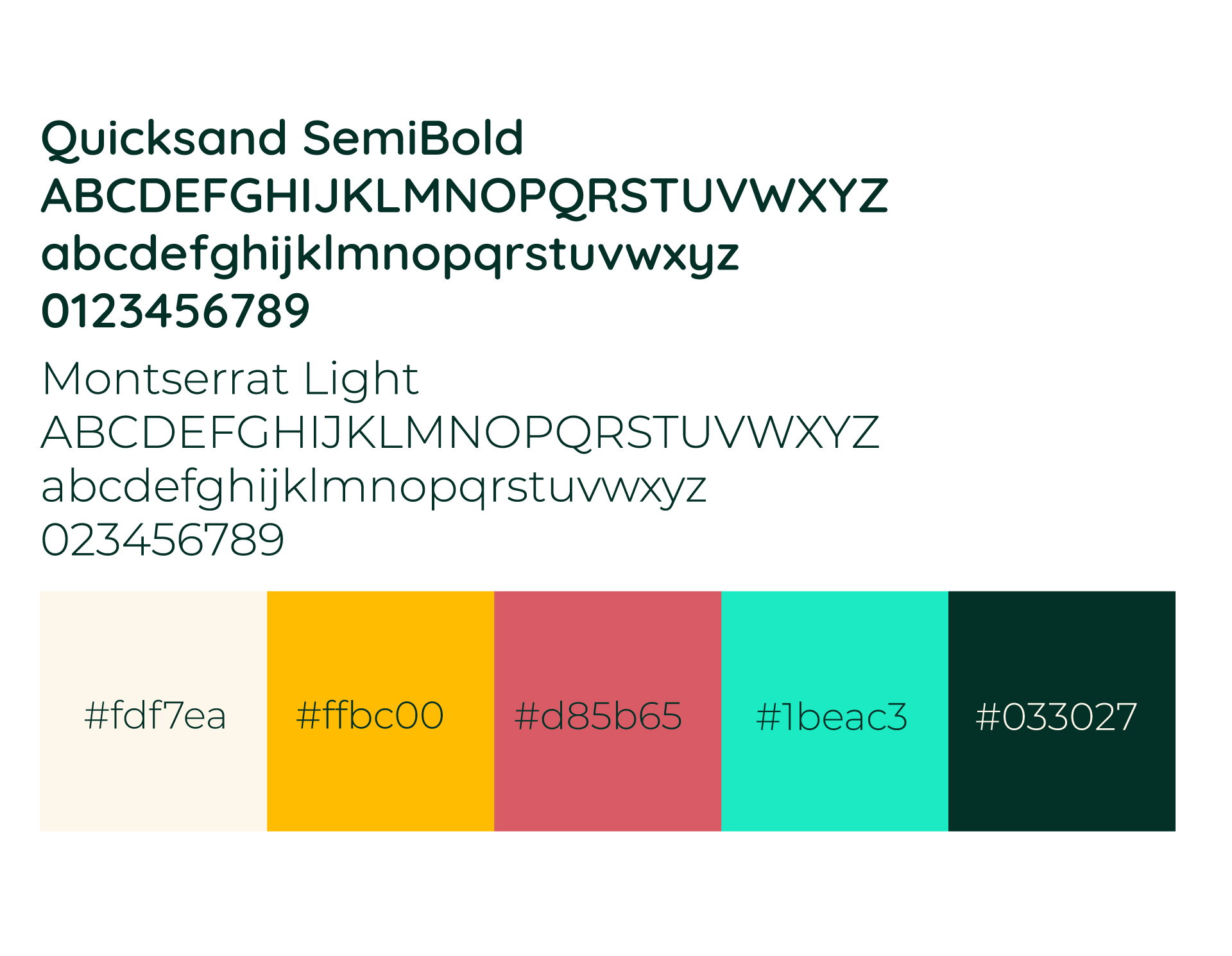
Eventually, I decided on a colour scheme that I believe reflects me well, which was also backed up by some peers. I went for a lot of warm tones and made sure there was a range of values, for greater variations and colour combos. I decided on a rounded font, to fit the personal, friendly tone of my brand, paired with a sans-serif font for contrast.
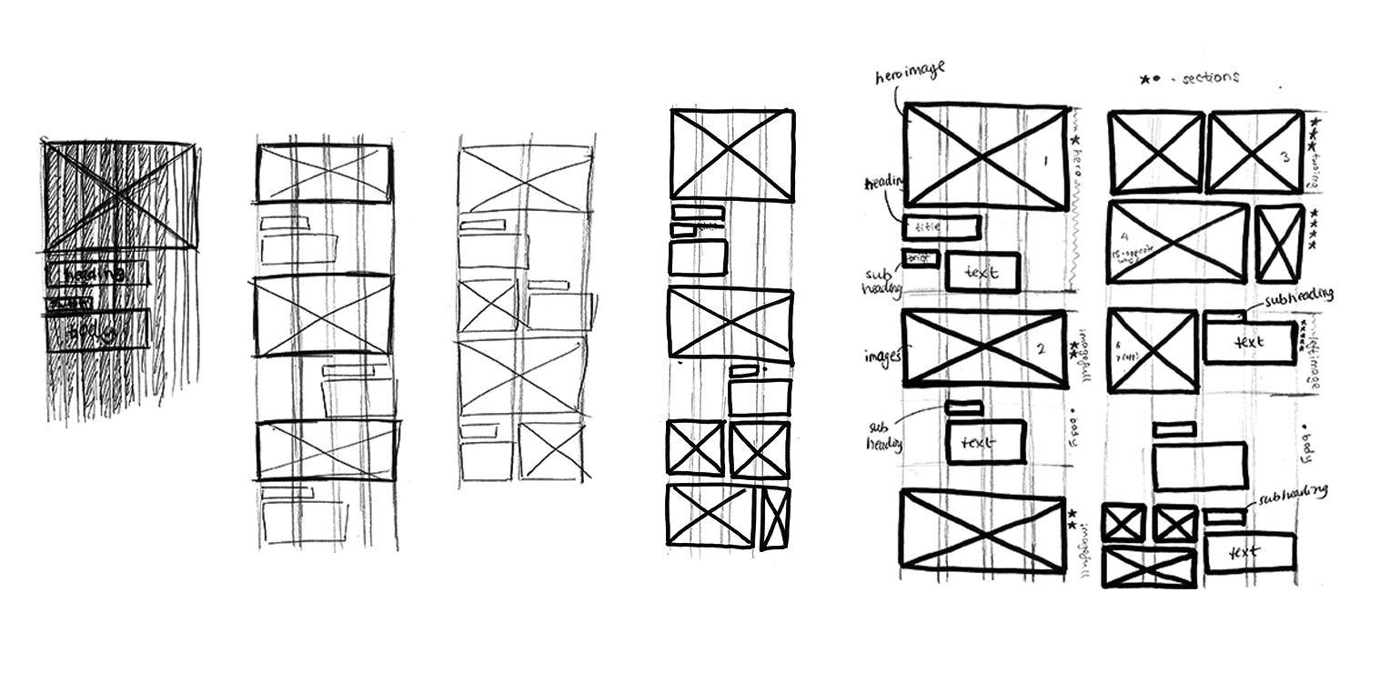
Wireframe Planning
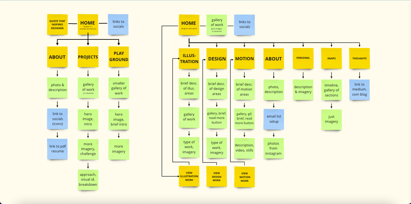
Early on, we looked into studio websites and analysed their structure and content. I then looked at portfolio websites and broke them down. Looking back on my visual research, I was most inspired by the left from a designer called thaongoc; I really liked the simplicity in the layout of her projects.
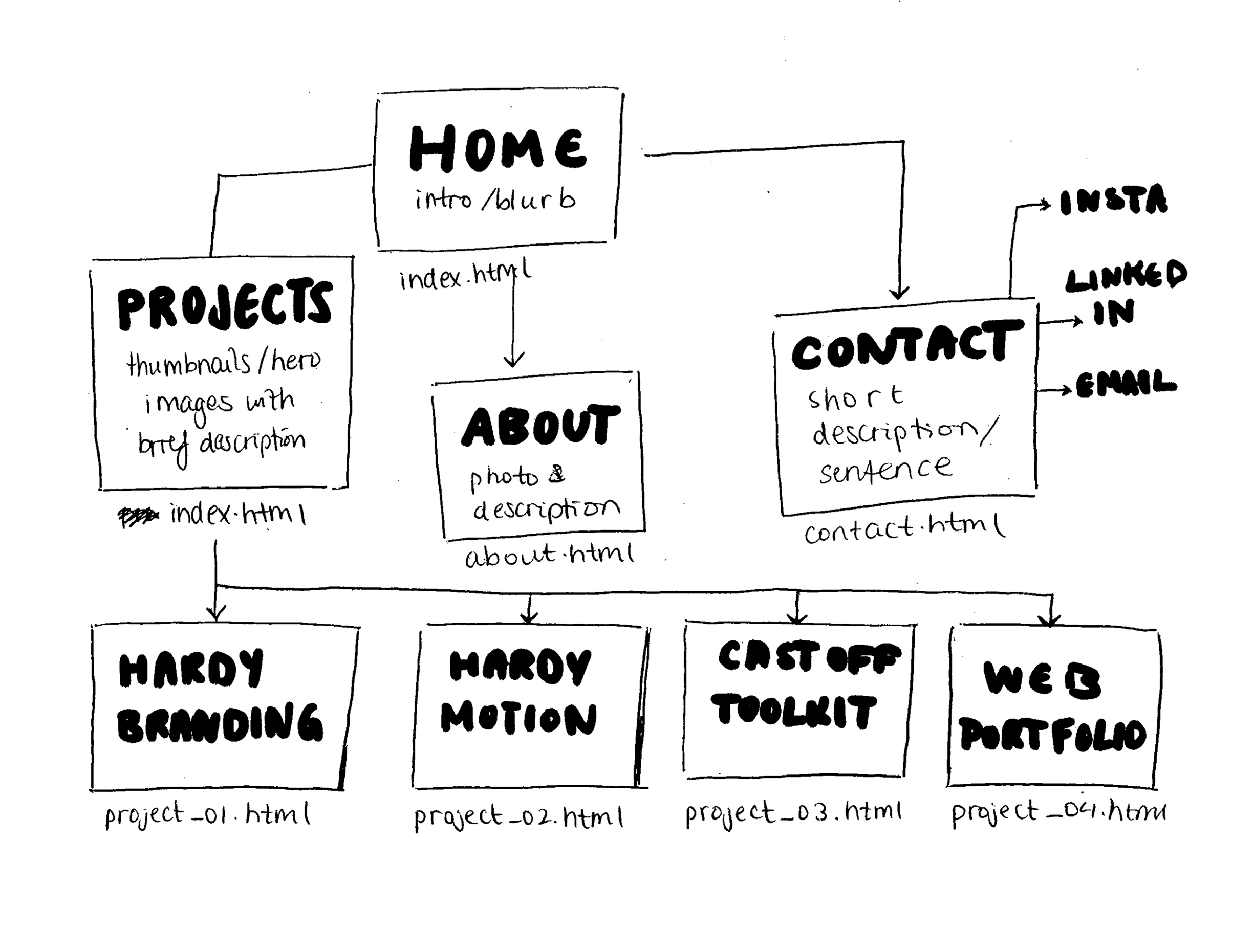
For my website, I went for a simple wireframe to keep the focus on the content.
Content Planning
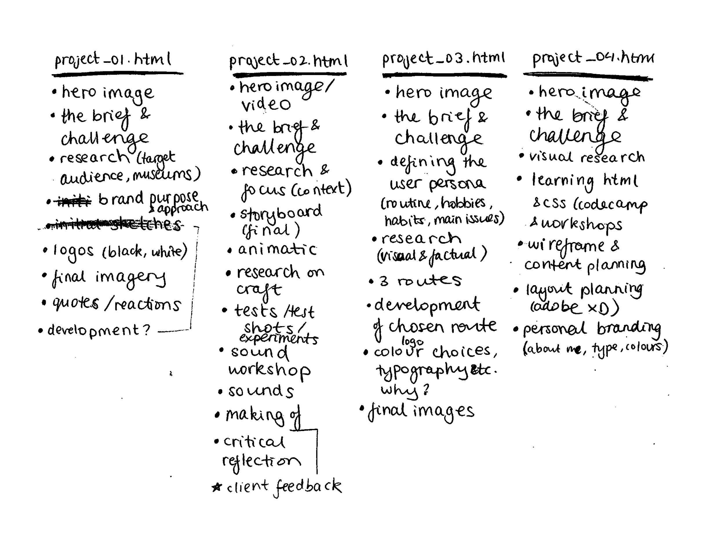
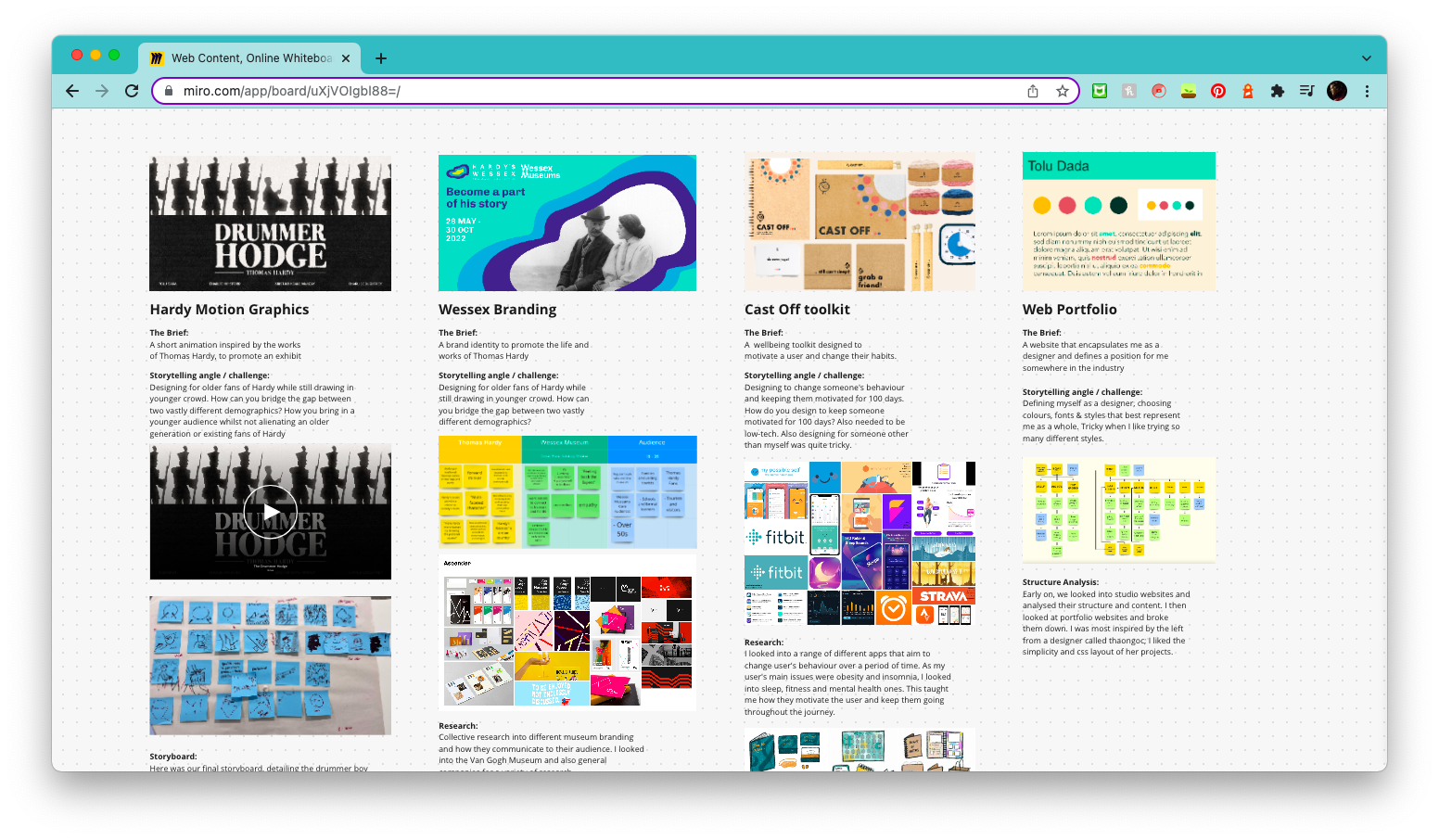
To start with, I looked back on my work and compiled each into organised folders, to get an idea of the structure. I then compiled my content on Miro, so that I could get an idea of how the structure would look on a web page. After I had a better idea of the visuals that would go in, I wrote out the rest of the content on a Google Doc, to purely focus on the ‘story’ of each project and making sure the paragraphs flowed well together.
Layout Planning
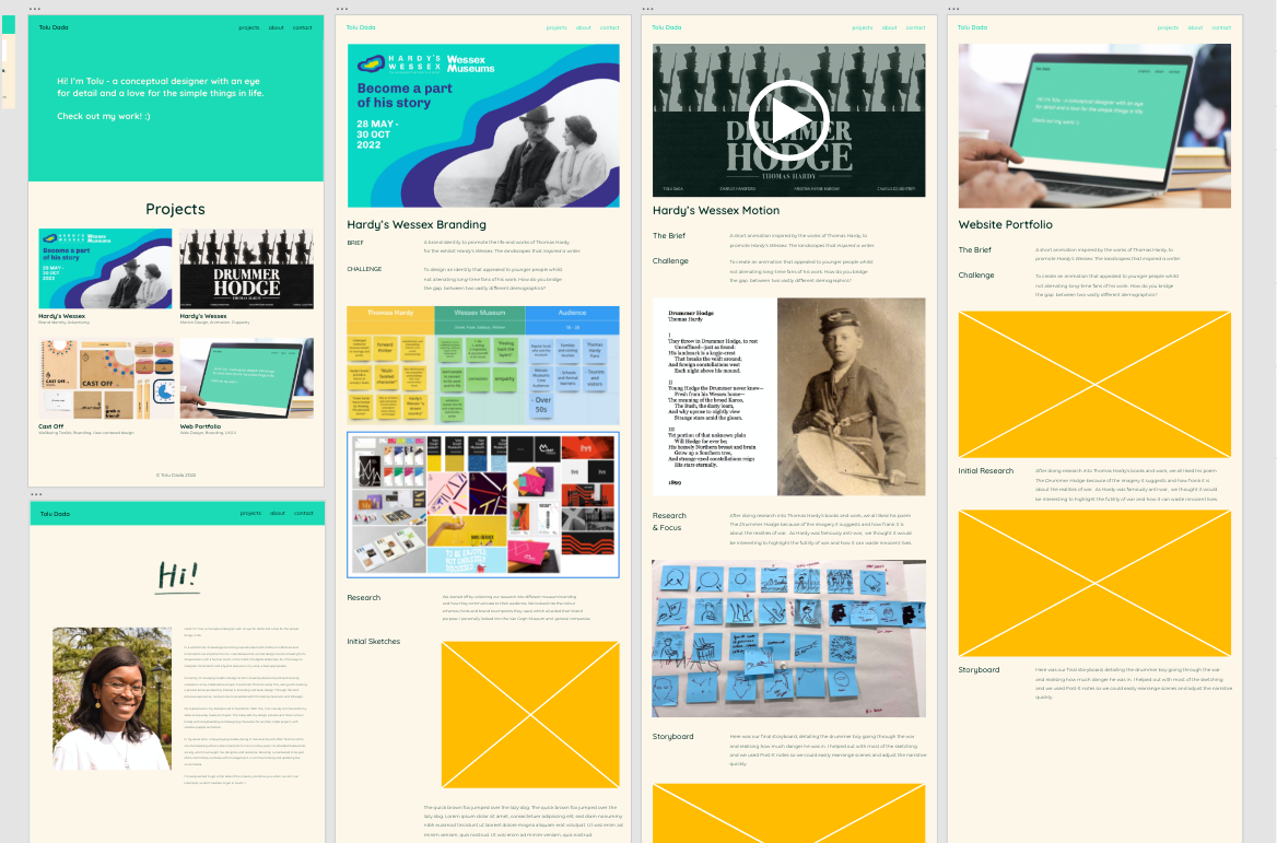
After learning and experimenting with coding, I used Adobe XD to lay out the visual style. This was a very useful part of the process, as I was really struggling to visualise what I wanted it to look like. With the prototype feature, it also helped me plan what kind of navigation I wanted around the pages.
Later on, I experimented more with different layouts: trying a 12 column and 2 column grid. Eventually I settled on a 4 column grid, similar to my process book on Hardy's Wessex, as I wanted something simple to focus more on the content.
User Testing
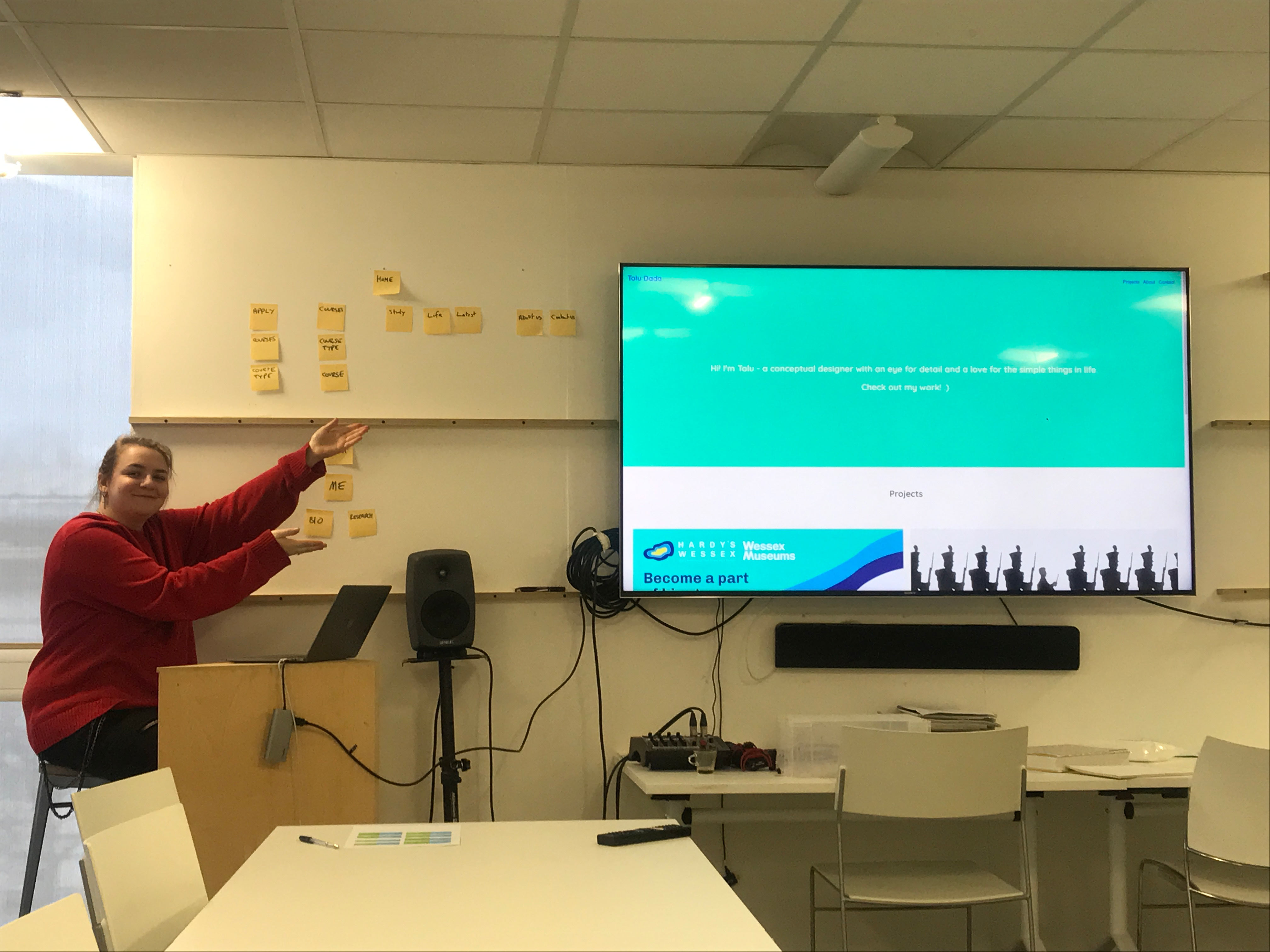
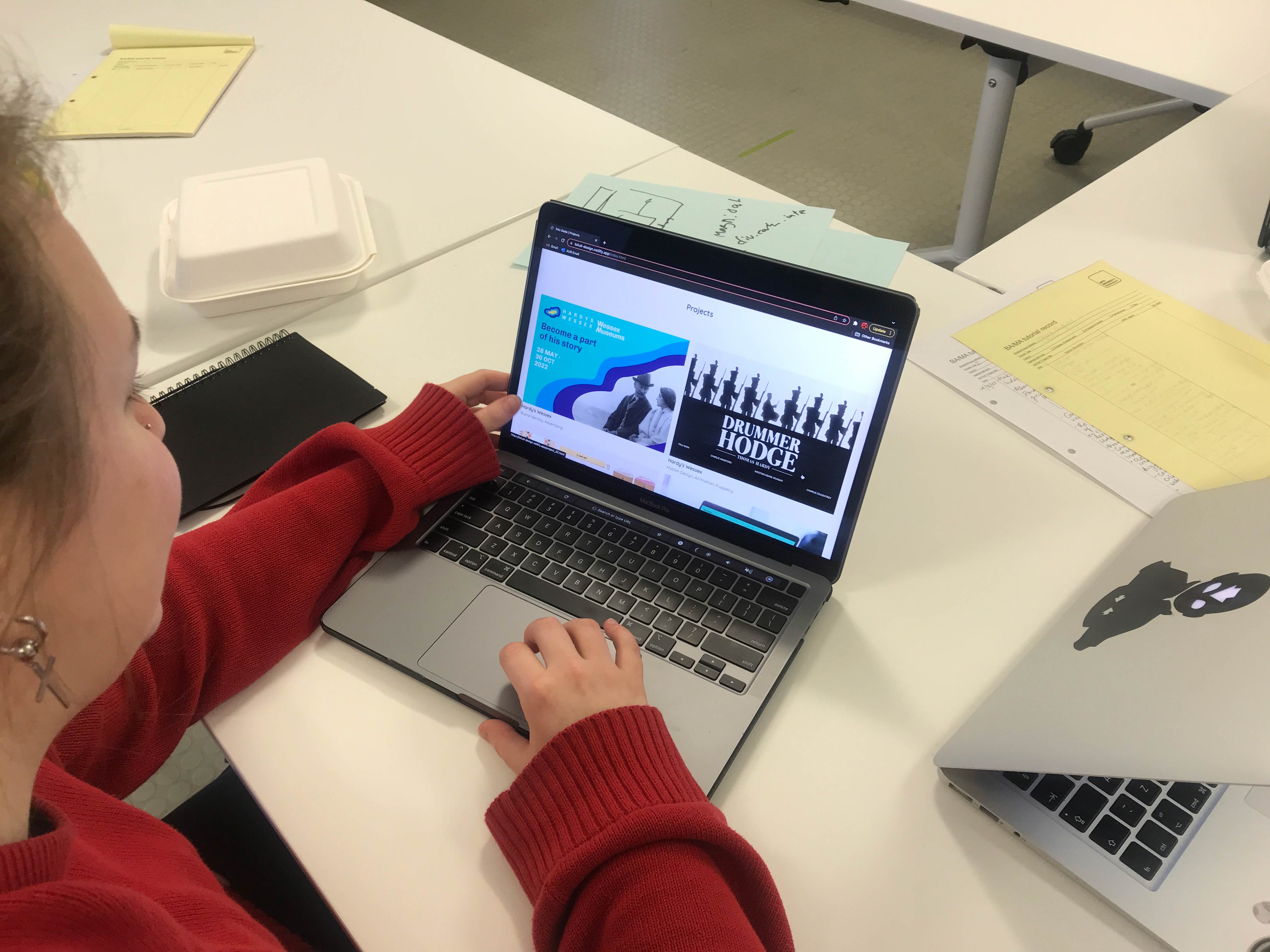
With the user testing, I was able to get hands on feedback from tutors and peers, on my live site. This was quite useful and I got constructive feedback. Some of these included making the text bigger on the index page, to have a stronger impact and relabelling navigation elements for better context.
For example, I just had 'Motion Design' as a label for my navigation at the footer but was suggested to change it to 'Motion Design Project'.
Refining Text
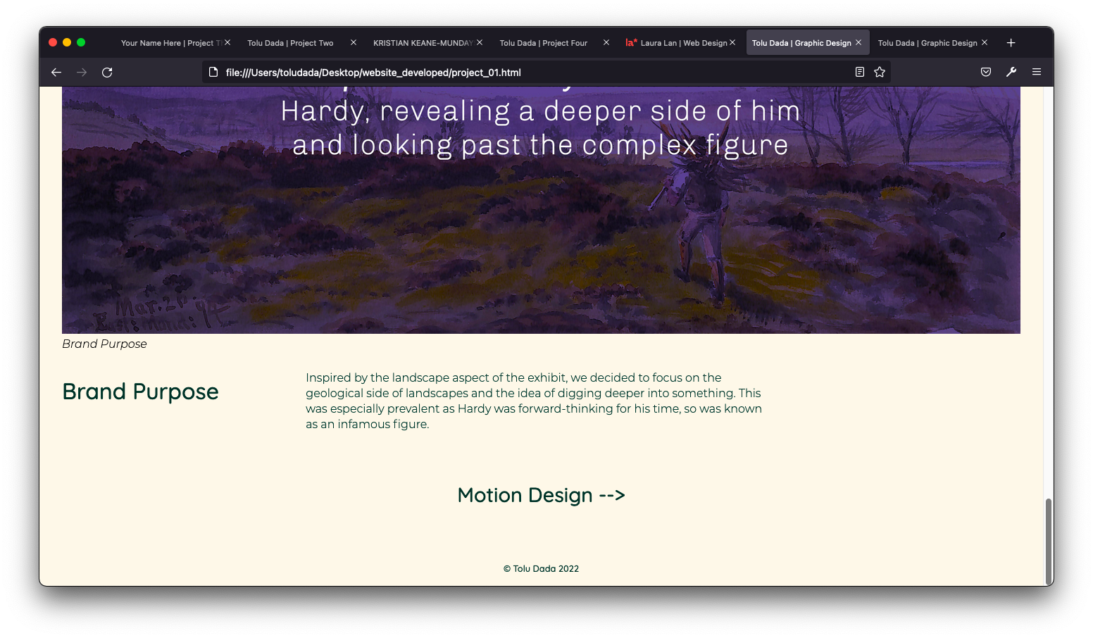
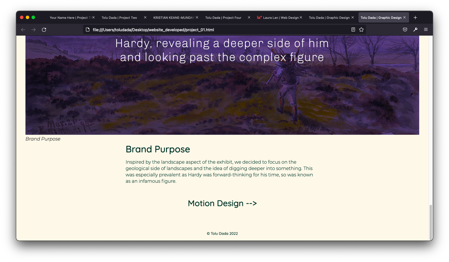
As I was working on the website, I realised the text was quite awkward to read. With the title being away from the body text, the flow of reading wasn't as smooth. Also, it was quite tiring to read through the paragraphs due to the long line lengths. They were originally around 80-90 characters.
To improve it, I changed the grid and placed the headings above the text and used padding to make the character length ideal for reading.
Critical Reflection
Overall, I’m relatively pleased with the final design of my website. Having never coded to this extent before, I’m proud that I managed to get a good understanding of HTML and CSS by the end of this project. I really like my home page, as I feel it’s approachable but professional in its tone. However, I do feel that I could have achieved a bit more. For example, with the grid. Whilst I would’ve preferred using the common 12 column grid for more variation, choosing the simple, 4 column grid was more appropriate for my current skill level.
One aspect I struggled with the most at first was understanding the CSS grid. During the workshops, it seemed simple enough but implementing it into a complex style sheet with many other elements affecting it made the process very time consuming. It wasn’t until the later end of the project that it finally clicked for me. Being a visual learner, drawing out the grids before putting the code in made the most sense to me. This, along with experimenting more with the code and not being afraid to mess up the grid to learn how it works.
Another challenging aspect was defining myself as a designer. I went through various iterations of personal branding and whilst I’m happy with my final colour scheme, I think the typography could be reworked. Upon reflection, I think the rounded font possibly comes across as too friendly and not the most professional. Writing the ‘About me’ section was also something I struggled with. It was quite difficult keeping it brief so the reader is engaged but coherent enough to communicate my values and various interests.
I intend to add more projects and elements to the site soon, as I felt I could have achieved more with it. One area I could have improved on was adding motion into the pages, such as GIFs. I think this would have made the user experience more exciting and added more interest to each page.